元素水平垂直居中的方法
写在前面:淦,怎么那么多种,当年看 CSS 没看完的恶果出来了
一、行内元素水平垂直居中
文本居中
父元素加入相关代码即可
注:不能让图片相对文字在单行中垂直居中
CSS
div {
line-height: 50px;  /*垂直居中,通常是父元素的高度。当行高等于父元素的高度时,文本会垂直居中*/
text-align: center;/*水平居中*/
}
图片相对文字在单行中垂直居中
在上面的基础上加入相关的代码
CSS
div i{
  vertical-align: middle;     /*图片与文字垂直居中,但会有少量偏差,再通过 */
  position:relative;   /*通过相对定位微调元素位置*/
  top:2px;     /*微调位置大小 */
}
二、利用定位+margin:auto
通常用于块级元素,并且需要知道元素的确切宽度和高度 实现代码:
html
<div class="father">
  <div class="son"></div>
</div>
<style>
  .father {
    width: 500px;
    height: 300px;
    border: 1px solid #0a3b98;
    position: relative; /*子元素可以相对于父元素进行定位*/
  }
  .son {
    width: 100px; /*如果子级没有设置宽高,则会被拉开到和父级一样宽高,因此需替换为实际值 */
    height: 40px;
    background: #f0a238;
    position: absolute;
    top: 0; /*将元素的上、左、右、下边缘都设置为 0。这会使元素在容器中水平和垂直居中。 */
    left: 0;
    right: 0;
    bottom: 0;
    margin: auto; /*将元素的边距设置为自动。这会使浏览器计算出等于的上下左右边距,从而使元素居中 */
  }
</style>
三、 利用定位+margin:负值
绝大多数情况下,设置父元素为相对定位,子元素移动自身 50%实现水平垂直居中
HTML
<div class="father">
    <div class="son"></div>
</div>
<style>
    .father {
        position: relative;
        width: 200px;
        height: 200px;  /*不要求父元素的高度和宽度*/
        background: skyblue;
    }
    .son {
        position: absolute;
        top: 50%; /*仅设置top和left,子盒子并不在父盒子中心,而是偏右下, */
        left: 50%;
        margin-left:-50px;/*需要将子盒子向上向右移动自身一半的值,实现水平垂直居中*/
        margin-top:-50px;
        width: 100px;
        height: 100px;
        background: red;
    }
</style>
四、 利用定位 + transform
与使用 margin 负值类似,但不需要知道子元素和父元素的高度和宽度
HTML
<div class="father">
    <div class="son"></div>
</div>
<style>
    .father {
        position: relative;
        width: 200px;
        height: 200px;
        background: skyblue;
    }
    .son {
        position: absolute;
        top: 50%;
        left: 50%;
        transform: translate(-50%,-50%);/* 将会将元素位移自己宽度和高度的-50% */
        width: 100px;
        height: 100px;
        background: red;
    }
</style>
五、flex 布局
自己比较常用的一种,flex 布局的关键属性作用:
display: flex 时,表示该容器内部的元素将按照 flex 进行布局align-items: 项目在交叉轴(cross axis)上的对齐方式。交叉轴垂直于主轴,center 表示这些元素将相对于本容器水平居中justify-content: 定义项目在主轴(main axis)上的对齐方式,center 也是同样的道理垂直居中
HTML
<div class="father">
    <div class="son"></div>
</div>
<style>
    .father {
        display: flex;/* 表示该容器内部的元素将按照flex进行布局 */
        justify-content: center;/* center也是同样的道理垂直居中 */
        align-items: center; /* center表示这些元素将相对于本容器水平居中 */
        width: 200px;
        height: 200px;
        background: skyblue;
    }
    .son {
        width: 100px;
        height: 100px;
        background: red;
    }
</style>
六、 table 布局
设置父元素为display:table-cell,子元素设置display: inline-block 利用vertical和text-align可以让所有的行内块级元素水平垂直居中
HTML
<div class="father">
    <div class="son"></div>
</div>
<style>
    .father {
        display: table-cell;
        width: 200px;
        height: 200px;
        background: skyblue;
        vertical-align: middle; /*用于设置元素的垂直对齐方式 */
        text-align: center;/*用于设置元素的水平对齐方式, center 值表示元素内的文本和内联元素在水平方向上居中对齐。*/
    }
    .son {
        display: inline-block;
        width: 100px;
        height: 100px;
        background: red;
    }
</style>
七、grid 网格布局
将网页划分成一个个网格,并且可以任意组合不同的网格以达到各种各样的布局效果. 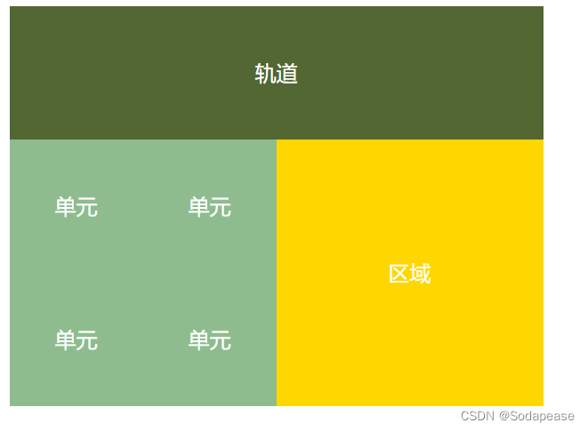
HTML
<div class="father">
    <div class="son"></div>
</div>
<style>
    .father {
            display: grid;
            align-items:center;
            justify-content: center;/*在 .father 元素中的网格项(包括 .son 元素)在垂直和水平方向上都居中 */
            width: 200px;
            height: 200px;
            background: skyblue;

        }
        .son {
            width: 10px;
            height: 10px;
            border: 1px solid red
        }
</style>
总结
不知道元素宽高可以使用:
- 利用定位+margin:auto
- 利用定位+transform
- flex 布局
- grid 布局
内联元素居中布局
水平居中:
- 行内元素可设置:
text-align: center - flex 布局设置父元素:
display: flex; justify-content: center垂直居中 - 单行文本父元素确认高度:
height === line-height - 多行文本父元素确认高度:
display: table-cell; vertical-align: middle
块级元素居中布局
水平居中:
- 定宽:
margin: 0 auto - 绝对定位 +
left:50%+margin:负自身一半垂直居中: position: absolute 设置 left、top、margin-left、margin-top(定高)display: table-celltransform: translate(x, y)flex(不定高,不定宽)grid(不定高,不定宽),兼容性相对比较差